


Google unveils a 'more beautiful' Google+

Articles & News
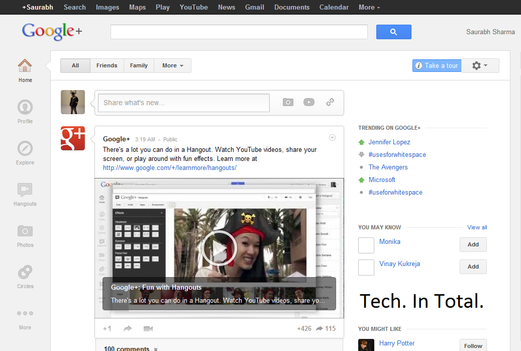
Google has taken the wrapper off of its redesign of Google+, which the search giant reckons makes the social network easier to use.
In a blog post, Google explained its reasoning behind the redesign, which is all part of Google's change throughout its whole portfolio – a change it hopes offers up more of a seamless experience for its users.
"Today we're introducing a more functional and flexible version of Google+. We think you'll find it easier to use and nicer to look at, but most importantly, it accelerates our efforts to create a simpler, more beautiful Google,"said Vic Gundotra, Senior Vice President, Google.
The main changes to the site include a dedicated section to Hangouts, better photo and video integration and a new 'navigation ribbon' on the left-hand side of the screen.
Not Just a Place to Hangout
"Today's Google+ update extends beyond navigation, the stream and hangouts," said Gundotra,
"For instance: there's a new Explore page that shows what's interesting and trending across the network. And a new profile with much bigger photos. And a new chat list that puts your friends front and center. And a whole lot more."

The updates will be rolling out to all Google+'s 75 million members in the next few days. But if you want to see what you will be getting, then check out the video below.
Like It? Share It
0 comments:
Popular Posts
-
 It's been about three years since Microsoft unveiled a new version of Office, and particularly with Windows 8 just months away from ...
 -
 There's general agreement that Sony stumbled out of the gate with the PlayStation 3. Months of intense hype were followed by a la...
 -
 Latest Windows Phone 8 rumor suggests that current Windows Phone devices will receive the update Microsoft has yet to come forward wi...
 -
Microsoft is holding an invitation-only press event in San Francisco today at which it is expected to debut the next version of its...
-
 Gaming & Gadgets Microsoft kick-started the "next-generation" of gaming on November 22, 2005, when the company release...
