A New Update to Google "The Google Bar"
Thursday, December 1, 2011 // by Saurabh //
Labels:
Gmail,
Google,
Google Mail,
Google Maps,
Google+,
News
//
No comments:

NEWS Six months ago Google started rolling out a new look and feel for Search, News, Maps, Translate, Gmail and a bunch of other products. Their goal was to create a beautifully simple and intuitive user experience across Google.
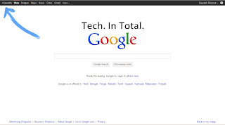
now they're ready for the next stage of our redesign — a new Google bar that will enable the users to navigate quickly between google services, as well as share the right stuff with the right people easily on Google+.
Instead of the horizontal black bar at the top of the page, you’ll now find links to your services in a new drop-down Google menu nested under the Google logo. We’ll show you a list of links and you can access additional services by hovering over the “More” link at the bottom of the list. Click on what you want, and you’re off.
To find out more about the new Google bar, take a look at this video
Like It? Share It
0 comments:
Popular Posts
-
It's been about three years since Microsoft unveiled a new version of Office, and particularly with Windows 8 just months away from ...
-
There's general agreement that Sony stumbled out of the gate with the PlayStation 3. Months of intense hype were followed by a la...
-
Latest Windows Phone 8 rumor suggests that current Windows Phone devices will receive the update Microsoft has yet to come forward wi...
-
Microsoft is holding an invitation-only press event in San Francisco today at which it is expected to debut the next version of its...
-
Gaming & Gadgets Microsoft kick-started the "next-generation" of gaming on November 22, 2005, when the company release...


